To first give a little background on this blog entry, as many of you know, I recently moved from full time employment to full time consulting and contracting. As a result, I have to withhold my own taxes. To facilitate this, I applied for a business savings account with my bank. However, the bank notified me that they wouldn’t let me open the account because, according to the state of Virginia, I’m not a corporate officer of my company! Seeing as I’m the President of Alagad and I wrote the articles of incorporation, I was a bit perplexed.
As a result I did a little googling and found the “secret” website that the bank was using to find out Alagad’s corporate officers. This leads me to the subject of this blog post: The worst website I’ve ever seen!
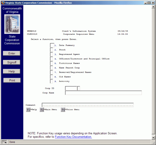
The Virginia State Corporation Commission provides a website to the public (ahem, not just to my bank). This website provides access to the SCC Corporation Information System (CIS) which can be used to look up Virginia corporations, their officers, and other related information. The entry point to the CIS isn’t that hard to find. It’s a big blue button at the bottom of the page linked to above. Clicking this button opens a new window which looks like this:

My first reaction to this page was, “huh?” From there I went through this thought process:
- How do you use this thing?!
- What do you put in the text boxes next to the numbered list?
- What’s the command text field do?
- What’s with the function keys listed at the bottom? That can’t be real function keys. I mean, hitting F2 doesn’t do anything when you’re on a webpage, does it?
- What’s the Enter key on the left do?
You may notice that the text box to the left of “1. Corporate Inquiry Menu” is wider than the rest. If you can enter two characters into that textbox, but no more. However, all of the other text boxes in the list only allow one character and it’s always shown as an asterisk. Wierd!
The command box is there, but you can’t type into it. Well, you can, but you have you have to select the dots and delete them before you can type into it. Amusingly enough, if you type anything into the Command field (after getting rid of the dots) and hit enter (on your keyboard or the enter button) the page refreshes and the command is listed again in the textbox, but in green and all caps. The rest of the text box is filled up with dots. My guess as that the command box would be better labled as “Uppercase, Turn Green and add Dots:”
I ended up clicking the Help button. This opened a new browser window which displayed a PDF (the bane of my existance!) The PDF was 49 pages long! Lacking other options I started reading it and gave up in the first paragraph when I read this:
Thank you for your interest in the State Corporation Commission’s (SCC) Clerk’s Information System (CIS) that allows you to directly access general information on corporations, limited partnerships, limited liability companies, business trusts and UCC filings. While CIS is accessible through the web, it is not considered a web-enabled system. The CIS system was originally designed for internal use by trained employees in a high volume data entry environment. However, the need to make this information more readily available to our customers through the Internet outweighs concerns regarding ease of use.
You’ve got to be kidding. I translate this to mean “anything is better than nothing, and if you don’t like it, get bent!” So, I closed the help window and started clicking and typing randomly till I figured the website out. It turns out that the two character text box next to the first list item allows you to enter the numbers listed in the rest of the list of what turned out to be options. Alternativly, you can “select” a text box by hiting any key. The asterisk displayed in the text box indicates that the field is selected. Once you’ve identifed the option you want, you can click the enter button and you get another menu! If you “select” more than one text box you get the page you were just on. (No error, just a refresh.) If you type bad data into the first textbox you get a very subtle error message.
I wanted to look up my company. So, I entered a space into the option the fist list item’s text box. I hit the enter button on the left. And loe-and-behold, I get a new menu!
Once again, a big, “Huh?”. This time I at least have a faint clue how the menu works. I know I want to look up my corporate officers. So I selected option 4’s text box, hit enter and I get this page:

I’m a bit confused at this point. I don’t know my corporate ID. I do know my corporate name, but I don’t know what typing it in to the Corp Name field will do. I have no idea what the unlabled textbox does. And then there’s a bunch of incomprehensible stuff below those text boxes. For instance, what do the 5 small text boxes do?! I must be in the wrong section. I need to go back to the last page. But there’s no back button. The web app doesn’t seem to provide a mechanism for going back either. However, being the smart technical wizard I am, I know that the backspace key acts as a back button in most web browsers. So I click the backspace button and I get the previous page.
At this point I decide to enter my company name in the Corp Name field under the text-field-as-checkboxes menu. I click the enter button hoping that something informative will come up. What do I get?

Arg! What the heck is this?! Why do I, as a user of this website, give a shit about synchronzation?! What is this talking about?!
After calming down, I click the Refresh button to see what will happen. What do I get, but this page again:

After thinking about it, I rememered that previous screens had information under the “Uppercase, Turn Green and add Dots” text box. As I recall, they said F2=Main Menu and F4=Prior Menu. But those were buttons and they’re not there any more. Well, what the hell, let’s hit F4 on my keyboard and see what happens. Much to my surprise, I’m taken to the previous menu! I didn’t even know you could use funciton keys in web applications! (Ok, I guess you could with JavaScript.)
Once again I type my company name in the Corp Name field. I click the enter button and I see this page:

This seems to be a list similar to other pages. However, it also seems to be the results of a search… or something. Oddly, the Search Name field shows “ALAIINC”. This is not what I typed into the Corp Name field on the previous page. However, I do see my company listed!
However, the text boxes next to list items have a hyphen in them. What’s this do? It’s a bit different from the other text boxes-being-used-as-checkboxes. Maybe it behaves like the other text boxes anyhow. I place my insertion point in the text box and hit the space key. Nothing happens. What the hell?! Eventually I realize I need to remove the hyphen and enter something else (just like with the “Uppercase, Turn Green and add Dots” text box!) After removing the hyphen I realise I can type anything into these text boxs. I enter a lower case “s” next to Alagad and click the enter button. I then get this screen AGAIN!

After staring at this for a while I realized that the Corp ID and Name fields are filled in and green. I don’t know what this means, but I’ll try selecting option four’s text box again and see what happens.
I get this page again:

However, this time my company name is listed and so are the corporate officers! And more importantly, I’m shown as the president!
In the end, I called my bank back and found out that they were, in fact, using the Virginia SCC website, but they couldn’t figure out how to get it to work! As a result, they couldn’t see me listed as the company president. I had to walk them though the process and, after much complaining, they finally gave me my savings account.
I thought the internet was supposed to make things easier!
What’s the worst web application you’ve ever seen?

Comments on: "What's The Worst Web Application You've Ever Seen?" (27)
In terms of user interface design, my vote goes to Amtrack. I tried to book a ticket with them over Christmas vacation and the trip-planner interface basically assumed that I would know exactly which routes I would like to take to get to my destination and which stops I would like to use as transfer points. Well, if I knew that, I wouldn’t need a trip planner, would I?
As for the technically worst application I’ve ever seen, I can’t make an announcement on that yet, but I will say that the "My fully fusebox 3 compliant site is in a single 3M file" has now been beaten. The user interface is pretty lacking too, but not as badly as Amtrack’s trip planner.
I love bad application examples! I run a column in my blog with horrible code samples. There has to be something to brighten our days and make ourselves feel better about our skills! <a href="http://www.blivit.org/blog/index.cfm?mode=cat&catid=8F1FBECC-65B8-E0AE-E60273372C0CEE1A">Blog Column Here</a>
LikeLike
Welcome to the world of mid-range/mainframe screen scrapers. We had an application like this about 9 years ago, in which existing "green screen" applications were automatically made available via the web. They were painful to use at best. It was the first generation of web enablement for those types of systems.
We’ve come a long way since then. Apparently, the Virginia Commonwealth has not!
LikeLike
For some reason, I think this application should be displayed on a black bacground with all the characters in Bright green.
LikeLike
I worked on an intranet application almost exactly like this a few years ago.
The design specifications were that the application had to behave "exactly" like their existing green screen application. That is, you should not ever need a mouse to navigate the app and the keyboard shortcuts, entry fields and tab order should be identical to the green screen app where possible.
The idea was to allow for a zero training cost transition from green screen to intranet app for existing users.
You would hope that they would have created a more useful interface for the uninformed visitor, but how it works isn’t really too surprising when seen in that light.
LikeLike
Yea, this web app is clearly a direct descendant of some old mainframe green screen application. It reminds me of the old reservation system they used to use when I worked for a hotel management company.
But, that’s neither here nor there. I think my critique is fair. I just hope the actual programmer behind this doesnt ever read this. If so, its not personal!
LikeLike
It’s not just a descndant of an old 3270 app – it _is_ one. Behind the scenes, theres a tool that is translating those screens to web pages and then back to green screens on the fly. The green screen is still running under the covers. It’s the entire reason companies like Attachmate can charge $$$$$ from products like this:
http://www.attachmate.com/en-US/Products/EXTRA+Mainframe+Server+Edition/EXTRA+Developer+Series+API+SDK/
Yep $$$$$ wil buy you that crap you had to use!
LikeLike
On screen scraping: I attended a presentation by the Orbitz team in which they said that they and everyone else in their industry must screen-scrape terminal sessions behind the scenes. They had some cool engineering tricks that let them do it much more efficiently than their competitors.
LikeLike
The worst web application I’ve ever seen was the online application for insurance via Blue Cross/Blue Shield of NC. It was this weird mish-mash of Javascript and server side scripting that was impossible to get through. For each invasive medical question you had to select the correct applicant from a drop down. The page would then reload and you had to select a medical condition. It reload again and you had to enter in details of previous treatment. If you’d already entered the doctor’s name before, too bad – you had to enter it again. In between each screen it showed a flash widget that said "saving application." It took over two hours to complete the thing, and then stalled out when I finally tried to submit it. I was ready to drive to their headquarters, find the web developer responsible for that atrocity, and strangle him.
LikeLike
As to how it works, it’s probably a fairly decent translation of the green screens behind it. Use tab to move between the fields and you don’t have to put anything into them to select menu items, just hit enter.
If I had a choice between nothing at all and this, I’d easily take this, every time. I think every public government system of record should be online, and the only way that’s going to ever happen is if they can use zero-programmer time systems like these to front for the real systems.
LikeLike
Sure am glad nothing I wrote made the list:-D.
It may not be the absolute worst web site I visited, but the site for my homwowner’s association is pretty bad, http://www.lhuoa.org. I am heading up the team to redesign the site.
LikeLike
I was going to list the MD Department of Labor, Licensing and Regulation, but they appear to be off-line. How’s that for bad?
http://www.dllr.state.md.us
LikeLike
Yep, what everyone else has said… that *has* to be an IBM 3270 mainframe app "converted" (and I use the term loosely) to CGI. It’d be much easier to use a Java applet in this case… heck, it’d be much easier just to tell people to download TN3270 and access the server that way.
LikeLike
Acording to the HTML, they seem to be using ResQPortal, from http://resqnet.com/
😛
LikeLike
Worst web app I’ve seen is the bill payment system for Con Edison.
LikeLike
In all fairness to our beloved Commonwealth, other agencies are waaaay ahead of the curve when it comes to technology. The DMV is a shining example, and smokes everyone else’s, including (especially?) California’s.
http://www.dmv.state.va.us/
LikeLike
Speaking of bad user interfaces, is there a way to unsubscribe from e-mail notifications for comments on this blog?
LikeLike
Oops….. Sorry Codeman38. I don’t know how I missed that one. It’s like I’m imperfect or something!
(I’ll be sure to add that asap.)
LikeLike
This isn’t a web application. It’s a (badly implemented) interface to an older type of IBM AS/400 minicomputer from the late eighties. Excellent computer system, but during the dotcom boom IBM forcefully tried to connect a terminal-based system to the internet, and this type of application was often the result. It’s like putting a corvette engine into a manure truck: no matter how fast it may be, it’s still a manure truck.
LikeLike
We’re running AS400’s here and I can tell you that IBM is still doing it today, albeit in a slightly more sophisticated way via a product called Websphere HATS which take old RPG green screen applications and convert them to JSP on the fly.
LikeLike
Rob, I see what you’re saying. However, the application is accessible over the web via a web browser. That fits the definition of "web application". So, no matter the logic behind such a poor implementation, it’s still a poor solution to the problem.
LikeLike
Yep – sure looks like a screen scraped AS/400 green screen to me. Judging from your description of it’s workings, I’d say the logic behind the program is pretty bad too.
They’ve taken the absolute cheapest route to "web enabling" their apps – and it shows.
See http://www.onofrio.com for an example of a site running on an AS/400 (renamed iSeries 400, then renamed to i5).
And yeah, I’ve coded on the 400 for 12 years. That particular web app sucks.
LikeLike
Doug, I wasn’t disagreeing with you – just stating that there are a ton of legacy apps out there that people are still screen scraping. The programused to do the one you wrote about is way old, and should be taken out back and shot!
LikeLike
I suggest you rename this article to "Who’s the worst Web User anyone has ever seen?"
I’ll admit that not having a back button is slightly annoying. However, by trying to cheat the UI like you did you caused most of the other issues you reported. Geesh, play by the rules.
LikeLike
Michael – Thanks for your feedback. I can certainly see your point. However, I encourage you to realize that I didn’t know the rules of the game – so how did I know I was breaking them?
Furthermore, web browser have built in and standard functionality. By using the functionality available to me (via the browser) am I really breaking the rules? I don’t think so.
And seriously, if an application is significantly more difficult to use than it needs to be, couldn’t that be called a "bad" application?
If nothing else, it’s an good example of a things not to do if you want you application to be easily used and understood by your audience.
LikeLike
Michael Slattery probably was the web developer who did the SCC site. 🙂
LikeLike
What’s sad is I know this product.
It is ‘IBM Host Access Transformation Service’ for Websphere.
In essence, you are getting a rendition of a telnet 5270 screen done in a web browser. Yes, this is what the product is used for. Yes, my government entity I work for bought this pos product. Yes, it costs $50,000.
And yes, we on the webteam have forbidden anyone to attempt to ‘program’ in this piece of garbage any longer, but we put one series of screens out to the public. So, we can’t get rid of this horrible thing.
$50k, which obviously Virginia forked out as well, for a glorified TN5270 screen…that obviously, doesn’t match in one case (the syncronize error says the screen has changed, so it can’t render it until resyncronized with the HATS product).
Yes, I know too much about this product.
LikeLike
I don’t know If I said it already but …Excellent site, keep up the good work. I read a lot of blogs on a daily basis and for the most part, people lack substance but, I just wanted to make a quick comment to say I’m glad I found your blog. Thanks, 🙂
A definite great read….
LikeLike